BRIEF
You must develop a visual identity for a consulting firm named Vanguard Partners.
They want to reposition themselves from “reliable but forgettable” to “memorable and progressive business partner”,
balancing authority with approachability. They value bold pragmatism and trusted partnership, and want to appear confident but conversational.
CREATIVE THINKING
The core challenge was repositioning without losing credibility.
The brand needed to feel fresh and confident without abandoning the trust they’d built over time.
I wanted to create a visual language that meets the modern standard and builds a memorable
personality that could hold its own next to the industry giants while feeling distinctly more human.
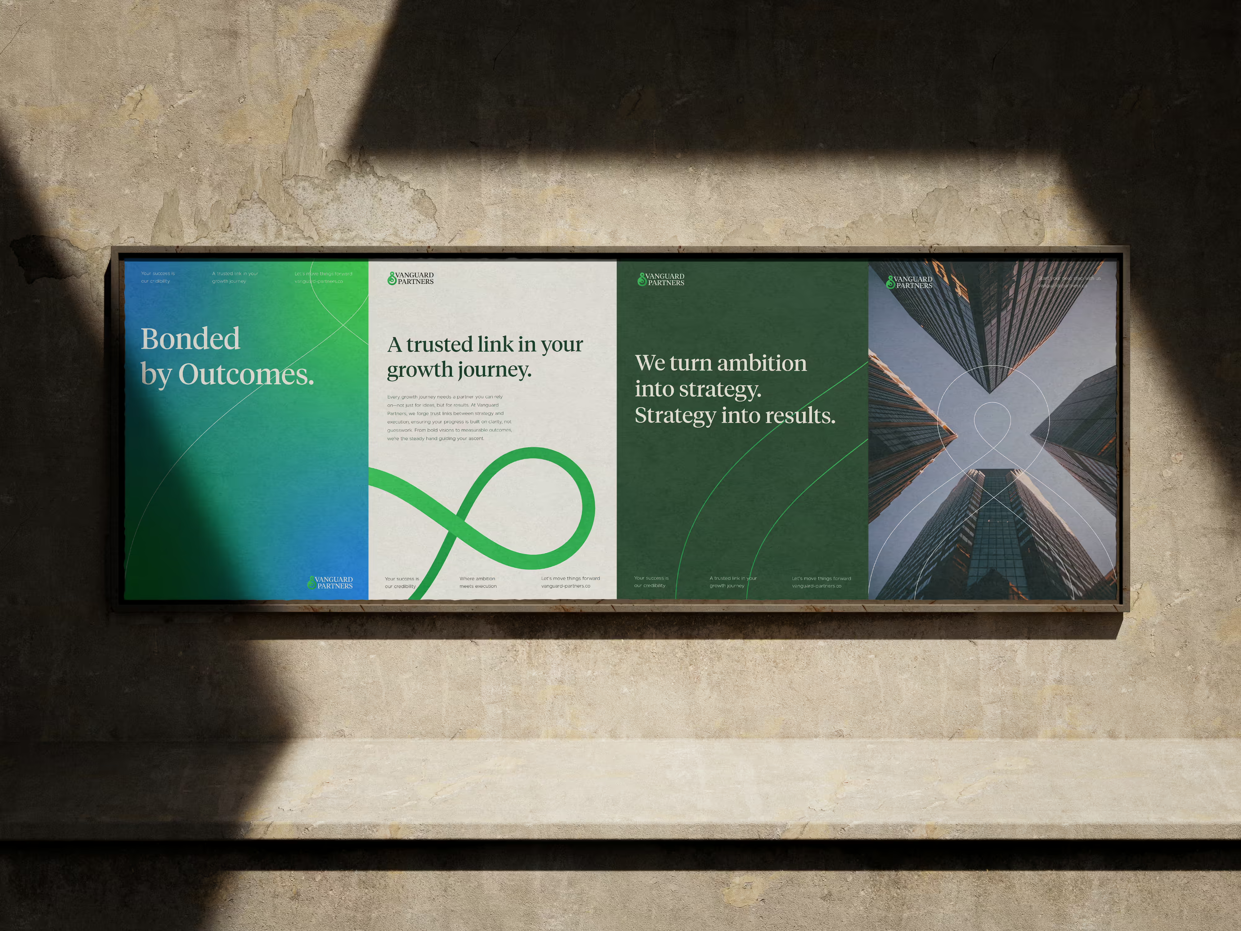
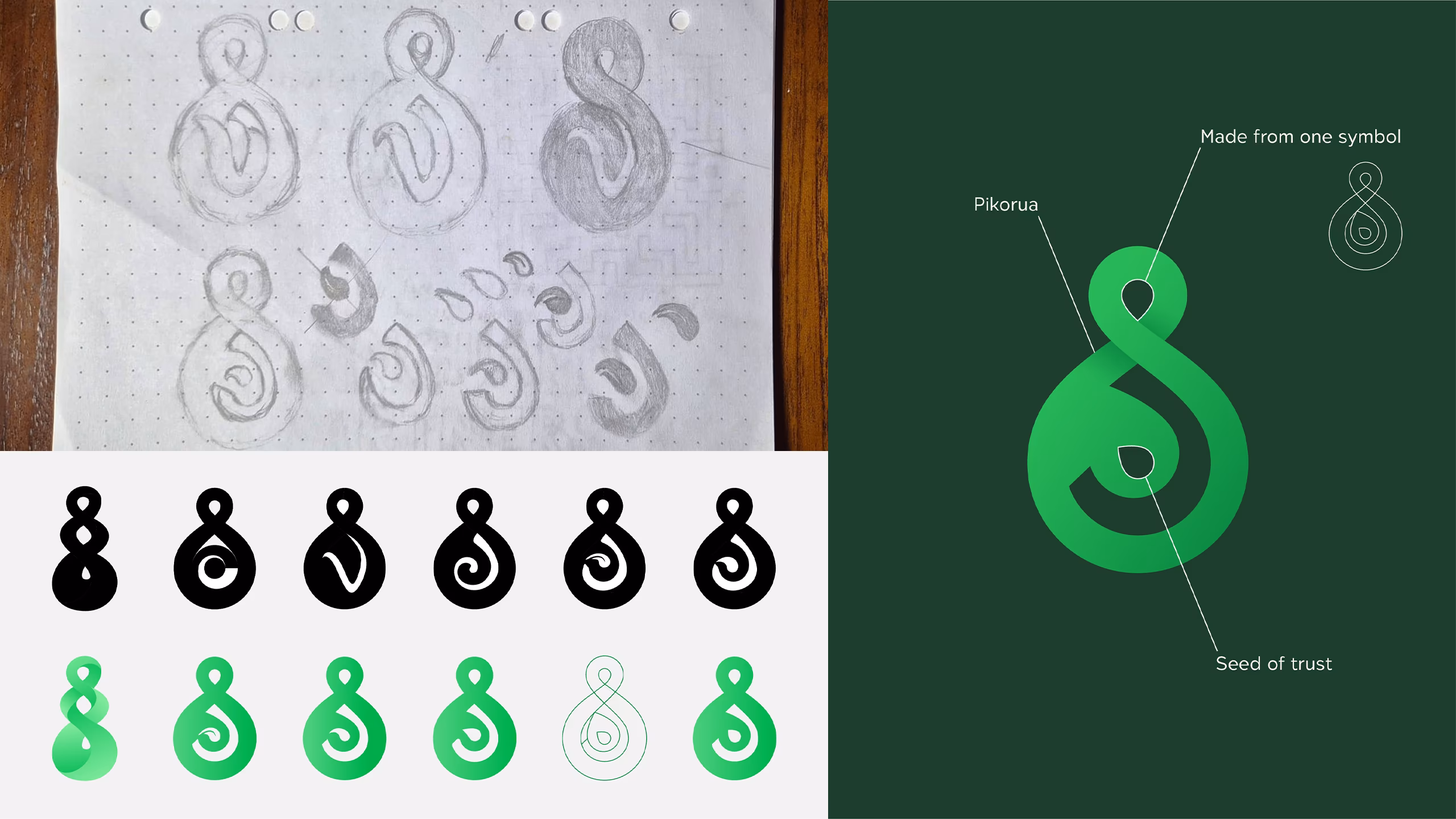
A symbol of two paths intertwining
My initial strategy aimed at emphasizing the importance of trust and partnership between the client and the consultant.
Finding a memorable concept that could represent this bond and could stand out among the overlapping circles and handshakes.
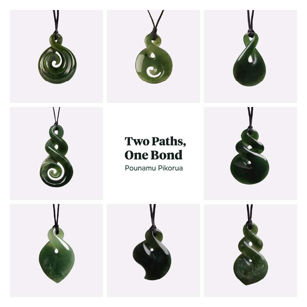
That is what led me to the symbol of Pikorua.
Pikorua is a Māori symbol, typically carved from pounamu (New Zealand greenstone/jade), representing the intertwining of two paths or people.
It takes the form of a double or single twist, resembling an infinity loop or a twisted figure-eight.
It carries several layered meanings. The main one signifying the coming together of two people, cultures or life paths.
Often interpreted as representing a bond between individuals, whether friendship, love, or partnership. The continuous,
unbroken line suggests eternity and the idea that once paths cross and intertwine, they remain connected forever.
A strong symbol I saw a lot of potential in. Its semiotic resonance fits the brief perfectly and I intended to build the brand around that.